CPS 353: Internet Programming
Web Design Principles
Simon Miner
Gordon College
Last Modified: 10/23/2013
Selected content adapted from material by Marty Stepp, Jessica Miller, and Victoria Kirst © 2012. Used by permission.
Agenda
- Scripture (Philippians 3) and Prayer
- Check-in
- Web Technology Research Project
- Rails Controllers and Views
- Milestone 6
- Usability, Accessibility, and Search Engine Optimization (SEO)
- Homework 5
Check-in
- Updates -- Syllabus, Project Overview
- Thursday, October 24 (tomorrow) Computer Club meeting with Win Mattina
- Milestone 5...
Web Technology Research Project
Ruby on Rails
Controllers, Views, and Functional Tests
Continued from last week
(starting on slide 16)
Milestone 6
What is usability?
- usability: the effectiveness with which users can achieve tasks in a software environment
- studying and improving usability is part of Human-Computer Interaction (HCI)
Common web usability problems
- cluttered or otherwise poor layout
- requires horizontal scrolling, or makes assumptions about user's screen size
- poorly chosen colors
- uses frames
- uses splash screen(s)
- poor or missing navigation controls (Back, Forward, Home)
- text is not scannable (can't be read quickly)
Content usability problems
- most important content isn't on the first page or "above the fold"
- nondescript headings
- too many ads (or things that appear to be ads)
- important site content is contained in PDF or other non-HTML documents
- isn't designed to be easily indexed by a search engine
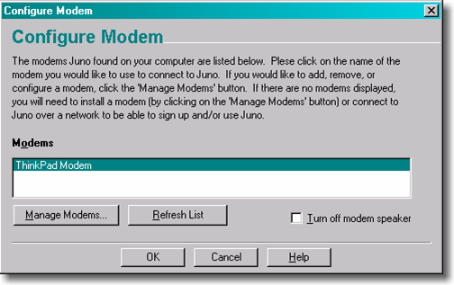
(HTML title, meta tags, page text, link text, etc.) - tiny thumbnails of detailed large photos:

Users do not read
 vs.
vs. 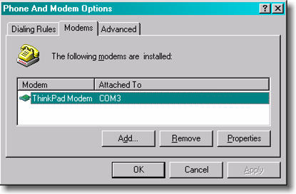
- Keep text short (as appropriate)
- Most important stuff goes at the top
- Use consistent organization between pages
Link usability problems
- links that don't say where they go
- badly chosen link text (such as "Click here for more info")
- links that forcibly open a new browser window
- links opened by complex Javascript needlessly
- visited links do/don't appear in a different color
- underlined content that looks like a link, but isn't
Feature usability problems
- poorly performing site search
- having a web search feature (why??)
- not having a site map or other means to navigate the site
- bloated images that are not optimized for the web
- relying on non-standard plugins or browser versions (e.g. Overly reliant on Flash, Java applets, etc.)
Web design suggestions
- place the site's name and logo on every page and make the logo a link to the home page
- provide search if the site has more than 100 pages
- write straightforward and simple headlines and page titles that clearly explain what the page is about
- structure the page to facilitate scanning and help users ignore large chunks of the page in a single glance: for example, use grouping and subheadings to break a long list into several smaller units
- instead of cramming everything about a product or topic into a single, infinite page, use hypertext to structure the content space into a starting page that provides an overview and several secondary pages that each focus on a specific topic
More web design suggestions
- Use relevance-enhanced image reduction when preparing small photos and images: instead of simply resizing the original image to a tiny and unreadable thumbnail, zoom in on the most relevant detail and use a combination of cropping and resizing.
- Ensure that all important pages are accessible for users with disabilities, especially blind users (<alt> tags)
- Do the same as everybody else: if most big websites do something in a certain way, then follow along since users will expect things to work the same on your site
- Jakob's Law of the Web User Experience: users spend most of their time on other sites, so that's where they form their expectations for how the Web works
- Test your design with real users as a reality check. People do things in odd and unexpected ways, so even the most carefully planned project will learn from usability testing.
Navigation
- URL structure of a site should reflect its navigation and/or content organization
- Common components
- Horizontal menus ("tabs")
- Vertical menus
- Fly-out menus
- Breadcrumb trails
- Good for users -- and also for search engines
Efficient Forms
- Minimize number of fields
- Group related fields together (i.e. address)
- Use appropriate default values
- Auto focus on first field of form
- Make forms usable with only a keyboard
- Make fields sequentially "tab-able"
- Auto focus on first field of form
- Use <label> tags to make options click-able
Proper Input Field Choices
- Single choice - user selects exactly one option
- Checkbox for yes/no, true/false, opt-in/out (i.e. "send me email")
- Radio buttons for 2-5 options
- List box for 5-10 options
- List box or text field (with auto-complete?) for >10 options
- Multiple choice - user may select more than one option
- Checkboxes for small-to-medium number of options
- Multi-selct lists for larger sets of options, sorted, with an appropriate number displayed at once in the list
- HTML5 form controls and widget toolkits
Client-side Form Validation
- lighting up required elements left blank or filled out incorrectly
- avoiding
alertunless absolutely necessary - server-side validation must also be present
CSS and JavaScript Design Considerations
- Prefer CSS to JavaScript whenever possible.
- Use :hover CSS pseudo-class rather than show/hid/toggle JavaScript/JQuery functions
- Create show and hide CSS classes, and apply them as necessary with addClass() and removeClass() JavaScript/JQuery calls
- Cleaner than show/hide/toggle JS calls, which add inline styles
- Declare CSS rules in the order you wnat them appliedi
- Precedence matches order of declaration
- Useful when you want to override a rule (i.e. removing an image) for a certain element
- Prefer class and id selectors to those based on (nested) HTML elements -- more precise
Ajax usability
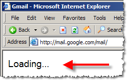
- since Ajax requests happen in the background, users may not know the page is loading
- well-designed web sites give visual cues to the user so they know to wait
Writing for the web
- People read web page text differently than they read books, etc.
- studies show that user's eye moves across and down the page in the shape of an "F"
- Writing for the web includes:
- subheads
- bulleted lists
- highlighted keywords (bold, larger, different colors, etc.)
- short paragraphs
- (put the most newsworthy information at the top, and then the remaining information follows in order of importance, with the least important at the bottom)
- a simple writing style
Sites about web design
Web pages that stink
What's wrong with each of these web sites?
- http://www.corvalliscommunitypages.com/
- http://www.pigletscatering.co.uk/
- http://www.bigbearparties.com/
- http://www.developingwebs.net/
- http://www.bobmarshall.com/
- http://www.orchy.com/dictionary/
- http://www.videosphotosanddjs.com/
- http://heaven.internetarchaeology.org/heaven.html#bottom Warning: Strobe-like effects make induce seizures!!!
- http://donswansonracingschool.com/programs.htm
- credit: webpagesthatsuck.com
Accessibility
- Everything should have a readable text counterpart
- so screen readers can process all content on a page
- include an
altattributes or captions for media tag (<img>, <embed>) - use descriptive link text, table header text/captions
- use title attributes to provide extra descriptions
- ensure that actual content reads from top to bottom
- be certain page renders if CSS and/or JavaScript is disabled
- graceful degradation
<noscript> tag
- highlight important content in multiple ways (color, text, size, audio)
- keeps the site accessible for blind/low-vision/color-blind/deaf users
- make the mouse optional for forms and web applications (i.e. Gmail, Feedly)
- make liberal use of white space
Search Engine Optimization (SEO)
- write great relevant content
- get people to link to your site (particularly popular sites!)
- use relevant keywords in link text
- example: My friend Professor Bjork is a swell guy!
- use a URL (domain and path) and page title that contains the keywords you want to match
- set descriptive
metatags - avoid practices that will penalize page ranking (duplicate content, keyword stuffing, all caps)
- don't do "black-hat" stuff (link farms, hidden text, etc.)
- use Google Webmaster Tools: https://www.google.com/webmasters/tools/
- Lots of overlap between accessibility and SEO (bots/crawlers/spiders processing site text)